

Here's what it looked like when we painted it a rich, creamy white for a total transformation:

Tons of work, but well worth the effort! When we decided to go white, all we knew was that we didn't want to pick a white that was too bright and too white. Too white, we thought, would translate into a cheap look for our wood, and we liked warmer tones. So how did we pick our white the first time around? We happened to be looking through the kitchen cabinet selections at our local Home Depot and came across a warm, creamy white cabinet door. We simply plucked the display door out of the rack {with permission from a Home Depot associate} and brought it to the paint counter to be color matched. We loved the result and used the color for all of our upstairs trim. And we lived happily ever after.... until January of 2011.
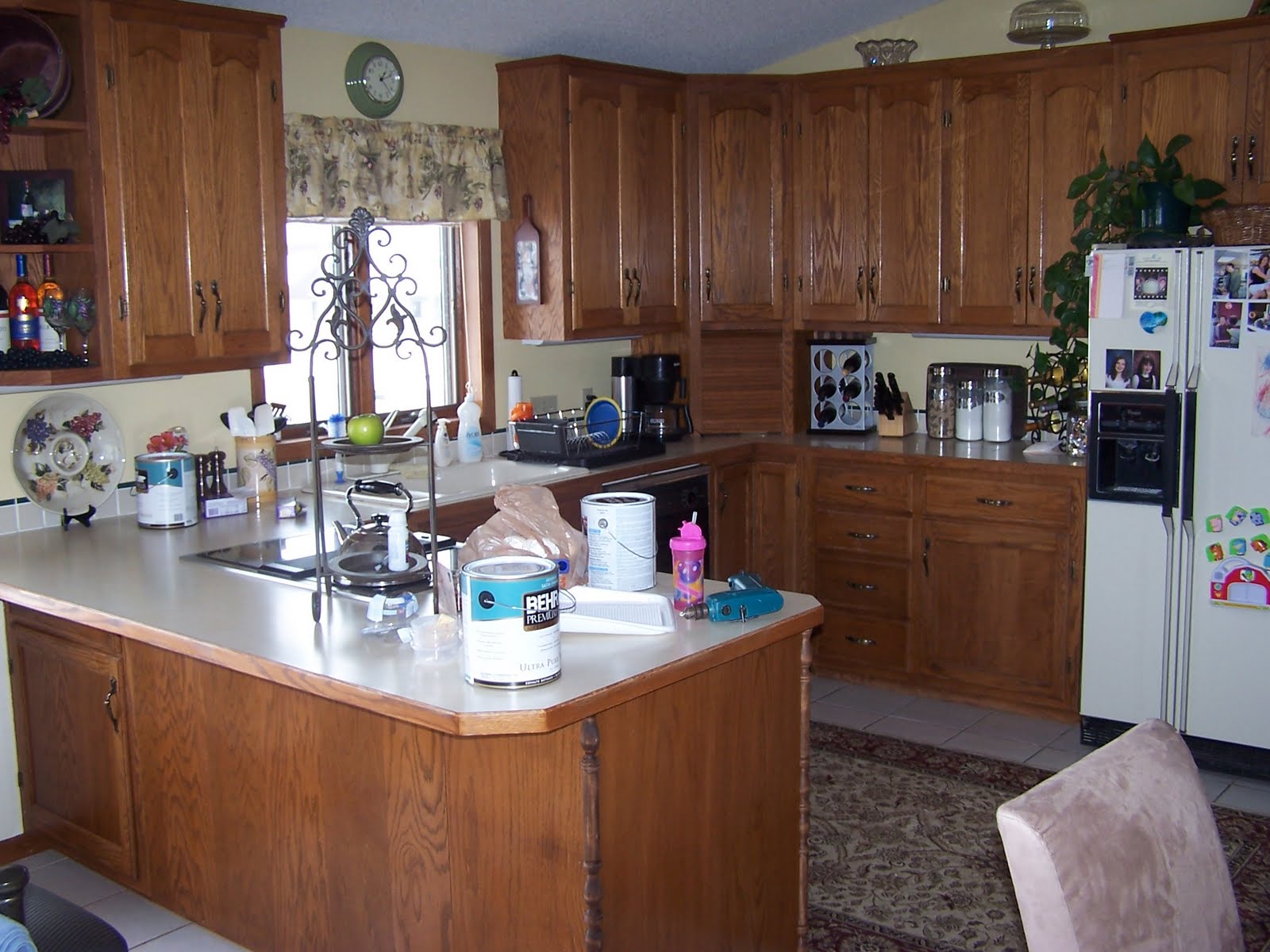
If you take a look at the color of our kitchen walls, you'll see they're a soft golden beige/yellow {Raffia Ribbon by Behr Premium Plus Ultra to be specific}.

A very pretty color, but being the paint and color fanatic that I am, I had grown tired of it and wanted a change. It was at this exact point that I ran into a problem. Our creamy white trim was so much of a cream rather than white that every paint chip I held up and every sample painted on the wall looked downright terrible next to it. Our trim, I discovered, was so far from white that I couldn't accurately call it white. The cream color of our wood affected how every single color looked on our walls. Think of it like this: you've heard that we each have a warm or cool skin tone, right? Those with warm skin tones look better in off-white shirts and gold jewelry while the cooler-toned companions look best in true whites and silver. The same thing was happening in the upstairs of my home! Because our white was such a warm tone, no cooler color looked good next to it. My husband thought I was out of my mind at first {"Do you know how long it will take to repaint all of the wood? Are you crazy?"}, but after a few days, he realized that I was right and agreed to go the whiter white route.
Holy cow. I had never searched for the "perfect white" before. I didn't realize that there are hundreds of whites to choose from. And here's something fun: what looks like a perfectly fine white in one light can look pink or blue or yellow or any other tint under the sun when you hold it up in another light. {"Fun." Did you catch the sarcasm?} We collected paint chips galore. Home Depot, Sherwin Williams, and Benjamin Moore paint associates recognized me coming in the door and didn't have to ask if I needed help anymore. I was there so often that they simply greeted me with "Hi! Still looking for that white?". I consulted my favorite decorating blogs. I Googled. I read everything I could about the perfect white and found that Benjamin Moore's Cloud White is regarded as the perfect white among several interior designers, but Cloud White looked a little too white in my home. I didn't want anything that gave off a blinding white glow with the lights on. Bottom line: I was picky and driving myself crazy.
 |
| Some of the white paint chips I've collected on this journey. |
I finally had a moment in the Home Depot parking lot, my lap covered in paint chips. Exasperated, I told my husband, "Just go in and get two gallons of Behr's Swiss Coffee." Warily, he left his crazy wife in the car, probably expecting me to run after him yelling, "Wait! Wait! Not Swiss Coffee! Come back!". It didn't happen, though. I realized that Swiss Coffee by Behr was a good choice. It was white but not too white, and it didn't give off any other hint of color. The deed was done. Finished. We drove home, busted out the brushes and rollers, and two coats later, we had a whiter, brighter upstairs. The difference from the old white and the new white was astounding. "It was never white! It was yellow!" I shouted to Dave. We high-fived and patted ourselves on the backs.
 |
| Here you can see the old "white" surrounded by one coat of the new white. Way to go Swiss Coffee! |
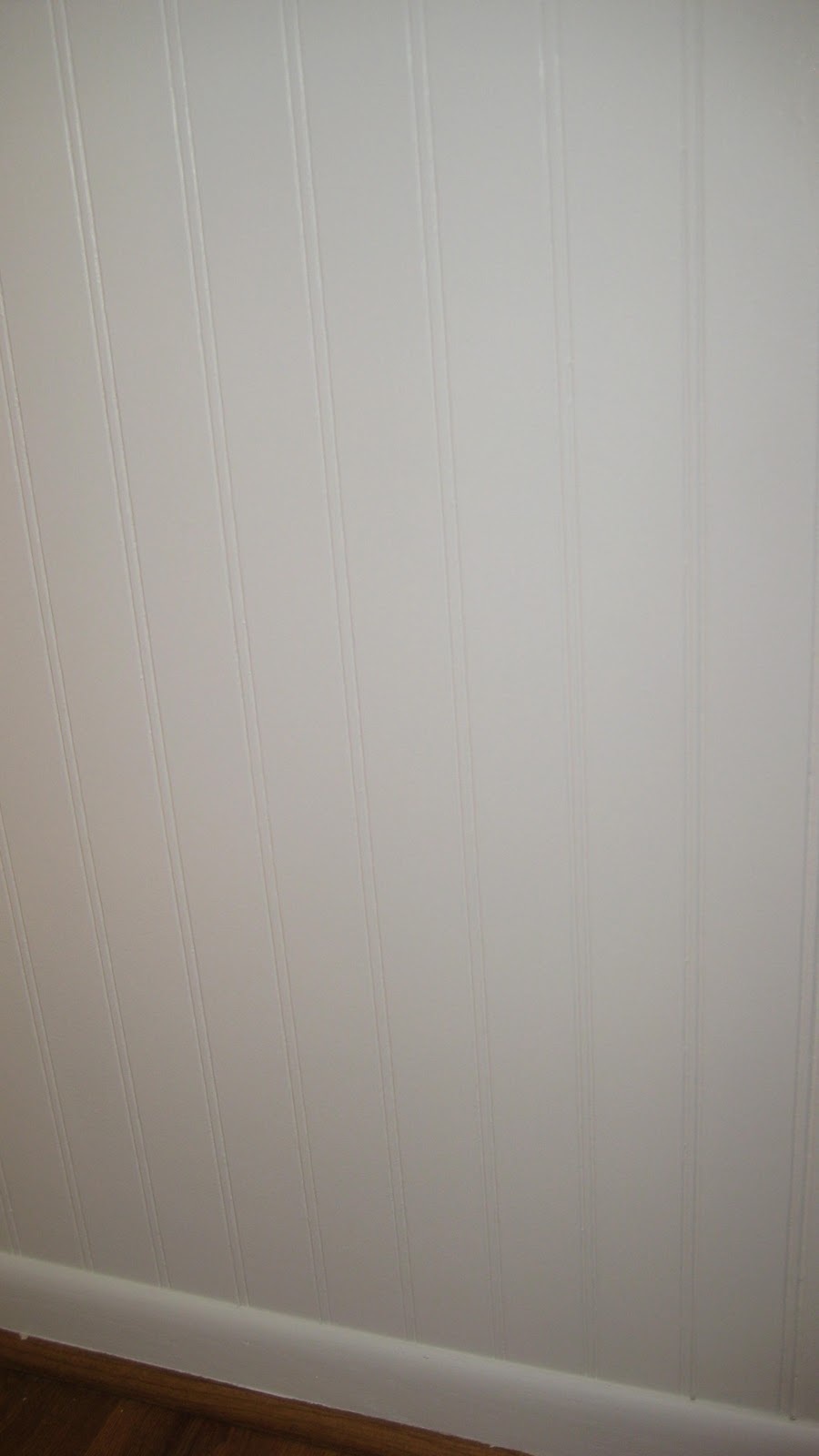 |
| Our beadboard, two coats of Swiss Coffee later.... |
Nice Blog. Your final choice looks great. What finish did you two end up with for the trim and cabinets? - Satin, Eggshell, Hi-Gloss etc.
ReplyDeleteThank you Azal! We used Satin for the trim and cabinets.
ReplyDelete