Showing posts with label Paint. Show all posts

April 11, 2011

A Warm Welcome

The entryway: it meets us at the end of a hard day, completely willing to let us check our baggage, literally, at the door. At my house, we drop heavy backpacks, kick off muddy rainboots, pile up library books and mail, and toss our keys down before we bolt up the stairs or down. The entryway is the first impression when guests walk through the door; it's the last impression when we bid them farewell. It's a room that's easy to forget about, but it's a room nonetheless.

Our entryway was another one of those rooms that we treated with haste; we hung some pictures, moved in what we thought we wanted, and called it "good enough." Sure, it's been painted two or three times {what room hasn't been painted at least that many times in my house?}, but as far as real thought and attention to detail, it was seriously lacking. When we did the whole Project Paint the House, I wanted to give real thought to the entryway and turn it into a space that I loved to see when I walked through the door.

Before I tell you what we did, let me show you what the space used to look like.


Upon walking though the front door, a coat closet was the focal point. We painted the closet doors white along with the rest of the doors and trim long ago, making the room a bit brighter. Jackets, boots, hats, gloves, mittens and scarves were stored in the closet; with a full four seasons in Wisconsin, we need all kinds of outerwear! Our artwork consisted of two random prints and a favorite framed photograph of Dave and me. None of it "went" together; we simply put it on the walls and called it done. Once upon a time we had a small desk as a catch all place for keys, phones, mail, etc. and a lovely antique mirror that has been in my family for many years. And finally, we had inherited a small wooden hook rail behind the door for coats and bags. Long story short, it wasn't pretty.

In planning a makeover for the entryway, I knew that I wanted a pretty focal point to lay our eyes upon  when we walked through the front door. In order to accomplish that, Dave and I decided to take away our coat closet and make a little nook at the back of the entryway. We removed the closet doors, the large rod, and one of the large shelves that ran across the length of the closet. A bold move when dealing with all of that necessary Wisconsin outerwear? Not really. We simply installed the coat rod and shelf right outside the door leading into our garage. When we're getting ready to blow this joint, we simply open the door to the garage and grab whatever coats we need - easy peasy. The entryway instantly appeared more spacious, and we were eager to tackle more. We removed the small hook rail and the three mismatched pieces of artwork. The small desk moved into our master closet. We took down the mirror and set it aside for later. With the room cleared out, our next step was adding life to the space through new colors.

In keeping with the new color scheme for the rest of the house, we painted the entryway walls Berkshire Beige, and the inside of the closet got some depth with Berkshire Beige's darker companion, Texas Leather. The railings got a do-over through new black and white paint, adding a bit of pizazz to the space. We purchased two new hook rails and mounted them to the right side of the door leading to the garage, giving us plenty of hooks for backpacks, coats, and bags. The antique mirror was placed on the left side of the garage door, a just-right spot to check yourself out before hitting the road. We decided to paint the doors black {Dave would call it dark brown} to tie them in with the railings. Remember that free dresser courtesy of my friend Emeigh? I painted it black and tucked it into the closet space. It's the perfect home for hats and gloves and mittens and scarves. That favorite photo of Dave and me hangs above the dresser, as well as a collage of our other favorite prints. Ready to see the final product?


Alice enjoys the new space as much as we do.
And I couldn't get her to move while I was taking pictures.

A possible layout

The chief picture hanger hard at work


Less clutter; more function


No more random pictures on the wall. Space to breathe!

We like our entryway a whole lot more now. It was thoughtfully decorated with a plan and style that worked for us. We don't just kick off our shoes and run up the stairs anymore. We take a few extra seconds to say, "We're home."

April 6, 2011

What's Wrong With This Picture?

What's wrong with this picture?

Not such an unusual sight at my house.

Pretty much everything. We're working on a little living room project at the moment, so books and framed pictures and telephone books and tools ended up on the kitchen counter, along with a can of Diet Pepsi, which my best friend's mother says will kill me. But did you notice my color fan deck in the midst of the mess? I've been toying with the idea of painting the kitchen cabinets green for a long time, remember? The one time I tried a sample on the cabinets by our barstools, I didn't love the color and painted them back to white. I filed the idea of green cabinets away for another day. Dave and I have recently gotten hooked on ABC's Modern Family, however, and I have fallen head over heels in love with Phil and Claire's kitchen. It's cozy, it's fresh, and the cabinets are a lovely shade of green!

via
Excuse me while I wipe the drool off my keyboard. One blogger guessed the cabinet color to be Castleton Mist by Benjamin Moore, but it's definitely not, at least not in my home. I just so happened to have a paint sample of Castleton Mist {Ha! Imagine that!}, and it looks far different from Phil and Claire's cabinets. Different lighting and environments can alter any paint color from home to home and even room to room; in my kitchen Castleton Mist takes on a very mint green tone.

I've been mixing different samples of greens and browns to find a recipe close to the shade on Modern Family. I'll continue looking through my paint chips, too, in pursuit of that perfect color. Will it work in our house? I don't know, but I'm not afraid to try it!

What have you done all wrong lately?

March 23, 2011

Right There in Black and White

We've been painting nonstop around here for the past couple of months - upstairs, downstairs, trim, doors, cabinets, and almost every wall in the house. The railings and spindles of our split level entryway staircases were no exception. At one time, they were painted the same cream color that the rest of the upstairs trim used to be. Obviously, that wasn't going to fly with Crazy Paint Girl me, and the railings and spindles were treated to two coats of Behr's Swiss Coffee.

In the middle of Project Paint. Dave was just about to tackle
the high seas with his high ladder {and by "high seas" I mean high walls}.

Pretty, clean, and certainly a brighter white, but something was missing. The railings lacked character, and I thought they could bring more charm to the space. I wanted the staircase to really pop, to be an eye-catching detail that demands your attention as soon as you walk through the front door, but in a classy way. It had to be classy and elegant, not all flashy and loud and crazy. I thought for a bit about the best color, the classiest compliment to white, and the obvious answer was black. What's more natural than black paired with white? The combination is timeless but still fresh. If you've been reading about the bathroom and bookcases, you might be able to guess that I was about to go down a path I'd traveled before, one leading me into a Dark Cavern - Dark Cavern by Behr, that is.

It took three painstaking coats of Dark Cavern to fully erase any trace of Swiss Coffee on the railings. Painstaking because the slightest slip with the brush and the world can see where you screwed up and painted black where it wasn't supposed to be painted. Despite careful taping, there were lots of Swiss Coffee touch ups to be done where Dark Cavern didn't belong.

Finally {finally}, the railings and the spindles were painted and touched up in their rightful colors, and the staircase was finished.


Even the small hand rail leading to the
basement got the Dark Cavern treatment.

Character and charm are no longer missing from the staircase; the crisp white against the soft black adds dimension and energy to the space. Want in on an added bonus to black railings? No more wiping away countless fingerprints, smudges, and smears from all who use the stairs. They're still there, of course, but I can't see them anymore, so they really don't count. We're happy with the staircase now. In fact, I think it's safe to say we love it.

A strand of pearls with your little black dress; the dark sharps and flats against the piano's white keys; little bits of starlight in an inky black sky. It's bread and butter, jam and bread. They go together.


And there you have it, folks. It's right there in black and white. Well, I guess since Dave and I still can't agree that the color is black and not dark brown, I guess we'll say that it's right there for you in Dark Cavern and white.

March 22, 2011

Bookcase Before and After

You already know that my father-in-law is a ninja. He's a ninja in his shop, making beautiful creations out of wood. The bar in our downstairs living room, our entertainment center {exact replica of the Pottery Barn Logan Media Suite}, and the kids' bunk beds are just a few of the projects he's worked on for Dave and me. Dave's younger brother, Jon, inherited some of their father's skills and has proved himself pretty handy in the woodshop, too.

When Dave and I got married, Jon's gift to us was a set of beautiful tall bookcases. They lived in our first apartment, and they moved with us into our first home where they've served us well in at least four rooms. Our brilliant children have found uses for the bookcases that I never would have thought of, including bunk beds.

Looks like cramped quarters.

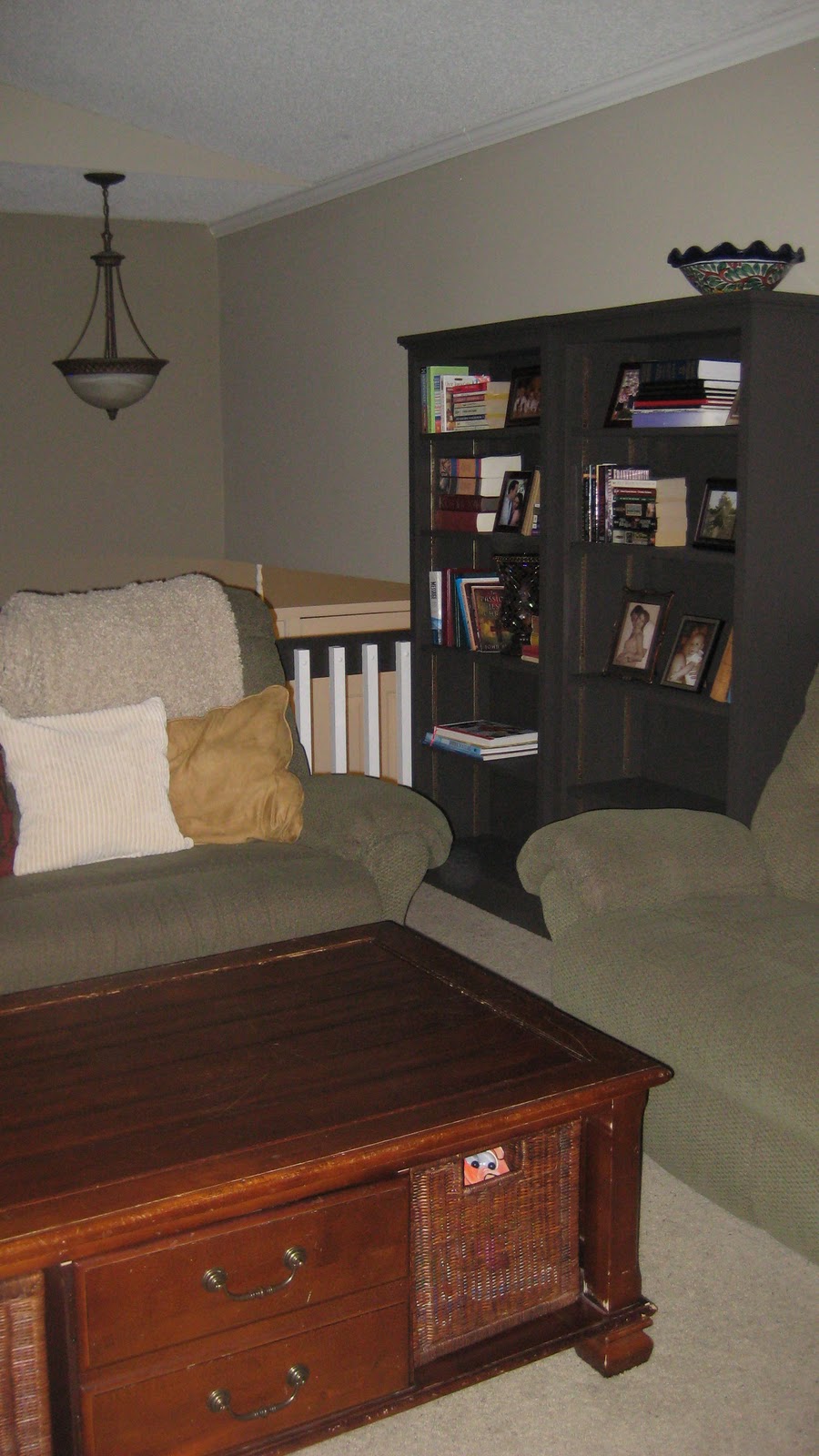
The latest move for the boockases was to the upstairs living room where I wanted them to hold books, pictures, and an assortment of other pretty items.


Fabulous, but I thought they could be jazzed up just a bit. Since the big bathroom makeover, I've fallen in love with black wood, especially black wood contrasted with a bright white. I had a whole lot of Behr's Dark Cavern left over from the bathroom project and didn't waste any time running Operation Bookcase Transformation by Dave. He loves Dark Cavern as much as I do and couldn't wait to see the end result.

Three coats of Dark Cavern later, and presto chango! These bookcases have gone from ordinary to extraordinary.


I love the contrast they bring against Grant Beige and Swiss Coffee residing on the walls. I've adorned their shelves with some of our favorite books and pictures.


If you look closely, you'll notice the bottom two shelves of both bookcases are bare. I think I might use that space for baskets to store the kids' favorite artwork and projects, but until I get a chance to shop for the perfect containers, I've elected to keep them empty. Why? There's a certain someone who takes great pleasure in ripping down anything placed on the shelves, and that little darling is vicious.


What have you transformed lately?

Side note: There is an ongoing "discussion" in the house about Dark Cavern by Behr. Dave calls it dark brown, and I say it's a soft charcoal black. So when I brought up the idea to paint the bookcases black like the bathroom cabinets, he said, "You mean dark brown?" Every guest in our home gets grilled: "What do you think? Do you think this color is black? Or would you call it brown? It's black, right?" For now, we've agreed to refer to the color by its name, Dark Cavern, to avoid any further discussions. But since I am the sole author of this blog, I will call Dark Cavern black, and if you're at The Home Depot and want to check it out for yourself, please do. But if you agree with my husband, kindly keep it to yourself. I could be ahead in this race and don't want anything to jeopardize my standings. That is all.

March 21, 2011

The Judges' Save

Is it cause for alarm if your family room goes from looking like this:


to looking like this?


Not if it turns out like this:


Dave and I spent a couple nights extending Berkshire Beige from the hallway leading into our basement to the wall behind our bar and Texas Leather to the other three walls of our lower level family room while watching American Idol. A couple hours on a couple nights gave us a whole new look for our space. We painted. And we listened to future rock stars jiving to their favorite songs. And we created a better flow to our home by bringing the upstair's color palette into our downstairs living area. And we debated whether Pia or James or Casey or Paul would be the next American Idol. If we were judging something, we would have used the Judges' Save to rescue the downstairs. But those throw pillows might not make the cut. Rock on.

March 14, 2011

Paint Reveal

Last time I told you all about the process of choosing new paint colors for our upstairs. We decided to incorporate three colors by Benjamin Moore into our entryway, living room, kitchen, hallway, and bathroom - basically the whole upstairs with the exception of the kids' rooms. After lots of thought, we took the plunge with Grant Beige, Berkshire Beige, and Texas Leather.

Grant Beige by Benjamin Moore

Berkshire Beige by Benjamin Moore

Texas Leather by Benjamin Moore
 
So how did we decide to lay the colors out? Our entryway got a total makeover {more on that later}, starting with the medium brown shade of Berkshire Beige. One special spot in our entryway was reserved for the rich brown Texas Leather, and the outcome was so awesome that I love coming in the front door! The largest space, the living room and hallway, was treated to the light and neutral Grant Beige. It's a perfect pairing for our sage green couches and white trim. We painted the partition wall between the living room and kitchen with Berkshire Beige to make it a bit more of a focal point to the eye as you walk up the stairs. The kitchen received an update with Texas Leather, and we painted the bathroom Berkshire Beige to set it slightly apart from the Grant Beige in the hallway. Here are the results:

Living Room Before:


 Living Room After:

The partition in Berkshire Beige.
I'm still accessorizing the bookcase; ignore this look!


Berkshire Beige on the partition wall reads
slightly darker than the Grant Beige on the rest of the walls.


Kitchen Before:


Kitchen After:


Grant Beige is on the walls above the cupboards, and Texas Leather rests on the
walls below. The dark gray-brown of Texas Leather is a perfect companion to the counters.


Louisa will turn one on St. Patrick's Day,
so we're in full party mode around here!

The new colors are so much more soothing and fit the bill for the more sophisticated and neutral look we want for our home.

Dave and I have made lots of changes to every room during Project Paint the Upstairs, including major changes to the bathroom. More of those changes coming your way soon! Have you found the perfect colors for your own home yet?


Related Posts Plugin for WordPress, Blogger...