What gets my heart pounding more than a room to organize and decorate? Just about nothing. So believe me, when my hubby and I found out we'd be parents to a fourth child, I was over-the-top excited about a new room to design. I adore kids' rooms almost as much as I adore the actual kids. Little Miss Louisa was reason enough to celebrate, but her room to decorate was the icing on the cake!
Something I always keep in mind when decorating a child's room is to make the room fit for the child, but also stylish, fresh, and fitting for the rest of the home. Your kid likes Mickey Mouse? Sure, who doesn't? But that doesn't mean you want Mickey all over the curtains in your living room. My advice is to avoid character bedding and decor. After all, kids change favorites about as often as I change my shoes. You don't want to shop for new Transformer bedding next year because Nick doesn't like Superman anymore.
Choose a theme for your youngster's room based on what type of vibe you'd like the room to have. Playful? Soothing? Whimsical? For our youngest daughter's nursery, I knew I wanted a room that exuded style and sophistication. My heart was set on a bedding set featuring icy blues, browns, reds, and a touch of yellow.
Finally, add decor suited to the style of the room. This comes in the form of artwork, blankets, lighting, and toys.
I shopped the house and moved (or rather had my husband and brother-in-law move) an old dresser into Louisa's nursery. After a couple coats of red paint and new knobs, it was ready to hold tiny onesies, adorable cozy warms (my term for footed pajamas), and snuggly socks. I added the beautiful dollhouse from my in-laws to the top of the dresser and flanked it with a pair of clear glass lamps holding shades in a rich brown.
New chandelier wall art completed the area.
Besides the bedding, my one big splurge for the room was the giant zebra rug. It covered our old painted cement floor and gave the room so much warmth.
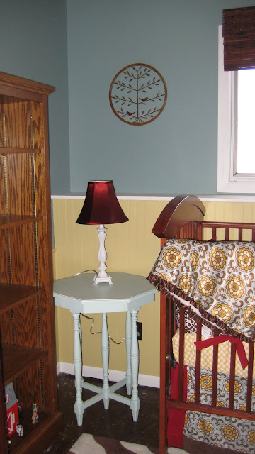
I painted a small table we already had and added a lamp with a shade in that same rich tone of red. The space above the table was treated to a piece of wall art found at JoAnn's for cheap. You can read more about that project here.
I chose drapes in a gorgeous ruby color and hung them right under the ceiling (rather than the top of the actual window).
We removed the old doors to the closet and added those same drapes, giving the closet area a glam feel.
A cozy table and set of chairs fit perfectly into the corner.
The red rose petal pillow on the child sized chair tied into the sophisticated look of the nursery and will give Louisa a perfect spot for looking at books.
I found these zebra bins at Kohls, and they're perfect for disguising diapers and wipes and all kinds of little baby things.
We shopped the house again and moved two tall bookcases on either side of the changing table. They house books, toys, pretty blankets, and lovies.
In my mind, I knew this room was screaming out for a red chandelier. You can read more about that process here to learn how I found a cheap white one at The Home Depot and transformed it into the perfect finishing touch for this nursery gone glam.
And what does Miss Lulu have to say about the finished product?
She's gah-gah over it.


Ooo! That zebra rug IS fabulous! :)
ReplyDeleteThanks for sharing!
i love this room. L O V E!!!
ReplyDeleteThank you!
ReplyDeleteI saw your girls makeover from dec of 2010 I saw the same crib in there and this was posted in Aug of 10 ,,, your babys room was amazing. What happened did you decided to move the baby from the nursery into the girls room?
ReplyDeleteHi Suzie,
ReplyDeleteYes! All three of our girls ended up sharing a bedroom for a bit. The older girls love having the "baby" (now almost two years old) in their room.