March 14, 2011

Bathroom Reveal

Remember way back when I got the itch to redo our main bathroom upstairs? It's the bathroom our kids use to take baths and our guests use when they visit. It's decent enough in size, but it was lacking - majorly - in style. This is what the bathroom looked like after we painted the cabinets white years ago:


White cabinets, white towels, white tile, and white shower curtain, if I remember correctly. It was one of those projects that I had started, said "Good enough," and left alone, never coming back to reassess. Then {Oh happy day!!} I received a catalog from Restoration Hardware with a stunning bathroom. The pages beckoned to me, calling out "Come in. Relax. Pamper yourself." Luxury! Do you remember?

Image taken from here.
It didn't take more than the spread on pages 22-23 of the Restoration Hardware Annual Bath Event catalog to inspire me to find the perfect dark brown-black paint and get started on my own bathroom transformation.

First, Dave removed the ugly tile backsplash and strange small counter over the toilet.


A couple coats of Behr's Dark Cavern to the cabinets, and we were well on our way to a bathroom redo.


In the whole Project Paint the Upstairs ordeal, the bathroom was repainted with Berkshire Beige right before Dave and his dad were about to install a new granate countertop.

Berkshire Beige took its place on the walls.

The new counter and sink waited impatiently
to be installed. Or maybe it was me who was impatient?

Just when we thought it was smooth sailing with the counter installation, we ran into a hurdle. The cabinets in the bathroom had been custom made, and they weren't a standard size. Rather than having to order a custom sized granate counter {and pay extra money galore}, we bought a standard sized counter and a new standard sized cabinet base to fit the counter. We weren't counting on the added expense of the new cabinet base, but the new counter would have been too wide and too deep for the old one. Add that to water damage to the inside of our existing cabinet from a crack in the old sink, and it was a pretty easy decision to go ahead and purchase a new cabinet base. The new base got a couple coats of Dark Cavern before Dave and his dad put it in place.

Watching Dark Cavern dry....

With the installation of the new cabinet, counter, and faucet, the bathroom was almost complete.


My favorite bit of bathroom decor went back up on the walls as soon as the paint dried....

Each baby's butt, only appropriate for the bathroom.

While I waited for the counter and cabinet to be installed, I had time to hunt for a new rug and shower curtain to match all this bathroom newness and found something perfect at Target. A shower curtain with subtle clean stripes and a fluffly, taupe rug rounded out the makeover.

I'm in love with the new shower curtain.

One last finishing touch: notice the panes in the window?


I adore the unique octagon shape of the bathroom window, but I wasn't in love with the cutesy panes. Lucky for me they're an insert that is simply set in the window. Removing the insert couldn't be easier, and it updated the look for free.


New tile is still on the agenda but not too high on our priority list. Dave and I don't dislike the white tile as much as we used to, and we're willing to live with it for now.

One last before and after:


Notice the fluffy new rug?


I'm so happy that Restoration Hardware catalog came in the mail. The bathroom went from "EEK!" to "Chic!". Have you stopped to think about changes you could make to love where you live lately?


Paint Reveal

Last time I told you all about the process of choosing new paint colors for our upstairs. We decided to incorporate three colors by Benjamin Moore into our entryway, living room, kitchen, hallway, and bathroom - basically the whole upstairs with the exception of the kids' rooms. After lots of thought, we took the plunge with Grant Beige, Berkshire Beige, and Texas Leather.

Grant Beige by Benjamin Moore

Berkshire Beige by Benjamin Moore

Texas Leather by Benjamin Moore
 
So how did we decide to lay the colors out? Our entryway got a total makeover {more on that later}, starting with the medium brown shade of Berkshire Beige. One special spot in our entryway was reserved for the rich brown Texas Leather, and the outcome was so awesome that I love coming in the front door! The largest space, the living room and hallway, was treated to the light and neutral Grant Beige. It's a perfect pairing for our sage green couches and white trim. We painted the partition wall between the living room and kitchen with Berkshire Beige to make it a bit more of a focal point to the eye as you walk up the stairs. The kitchen received an update with Texas Leather, and we painted the bathroom Berkshire Beige to set it slightly apart from the Grant Beige in the hallway. Here are the results:

Living Room Before:


 Living Room After:

The partition in Berkshire Beige.
I'm still accessorizing the bookcase; ignore this look!


Berkshire Beige on the partition wall reads
slightly darker than the Grant Beige on the rest of the walls.


Kitchen Before:


Kitchen After:


Grant Beige is on the walls above the cupboards, and Texas Leather rests on the
walls below. The dark gray-brown of Texas Leather is a perfect companion to the counters.


Louisa will turn one on St. Patrick's Day,
so we're in full party mode around here!

The new colors are so much more soothing and fit the bill for the more sophisticated and neutral look we want for our home.

Dave and I have made lots of changes to every room during Project Paint the Upstairs, including major changes to the bathroom. More of those changes coming your way soon! Have you found the perfect colors for your own home yet?


March 9, 2011

Many Colored Days

"Some days are red, Some are blue.
On different days, I'm different too.
You'd be surprised how many ways
I change on different colored days."
     ~Dr. Seuss, My Many Colored Days

I thought it appropriate to start out this post with a little help from my favorite rhymer, Dr. Seuss. While sifting through hundreds of paint chips looking for that perfect combination of colors for my home, I noticed that my mind could change as easily as the days. Some days I poured over my collection of grays, some days I wanted blue, and the next day it could have been beige. The problem was that I liked too many color schemes; I keep a binder of ideas and inspiration projects, and I'd love them all for my home. One anchor I clung to: I did not want any yellows. We had painted several shades of yellow on our walls in the six years we've lived in this house; I knew it was time for a change. I also knew that any shades of green, red, pink, purple, and orange were not in the cards. You'd think that being left with blues, beiges, grays, and greiges {the marriage of gray and beige} would leave me with a easy task, but that wasn't the case. I did have a couple starting points that helped with the color selection process, however.

The first starting point was our living room furniture. When Dave and I decided to buy our house, we got all excited and giggly and did what any other young, logical couple does: we went furniture shopping... before we actually moved into the house. Oops. That oversized sage green couch and her matching companions, the snugglers {my own term for those two-seater half-chair/half-couch space-sucking-beasts} were purchased and stored away for our home before we knew it. I do not have a problem with the couch. It's large, it's comfortable, and it's our favorite family reading spot, but the snugglers, well, let's just say I could live without them in my life. Until we decide that new living room furniture is in the budget, however, they are here to stay, and I need to choose paint colors with them in mind {something I had not done so well in the past}.

For the benefit of readers everywhere struggling to choose paint colors,
I give you the living room two paint colors ago, green furtiture and all. Note the snugglers.

See how atrocious this color looks in this space in artificial light?
Kind of like split pea soup gone horribly wrong...

In my defense, I think I was pregnant when
I chose this color. That's my only defense, people!

A second starting point was previous knowledge. Living in our home for six years, we've learned quite a lot about it. For instance, our living room is sunny and bright in the daytime, thanks to a whole wall of windows. At night, however, due to lack of ceiling lighting, we have only lamps to brighten our space. I knew from past experience that we'd be happier with a color that didn't make us feel caved in at night. Other insight I had gained was that I'd like to have the colors flow and work with each other throughout our home. We've all walked through a house where every room seems to have a completely different vibe. "Here's the red living room. Here's the blue kitchen. Over there is the green bathroom." It can be a shock to our eyes to adjust to a completely different color when we walk from space to space, and I wanted to prevent that. A final thought I hung onto when selecting colors was that I tend to grow tired of things quickly. If I kept the walls very neutral, I could easily switch my accessories around when I wanted a change. I'd rather pop some new throw pillows on the couch or shop for a new piece of artwork than repaint the entire upstairs.

So I knew that our new colors had to go with our green couches, they had to be light enough to work at night, they had to work with each other to create a nice flow from space to space and be neutral enough to keep me happy for {hopefully} a very long time. After several paint samples and input from everyone from the kids to the pizza delivery guy, Dave and I settled on three colors to build from. The winners are {drumroll please}....

Grant Beige by Benjamin Moore

Berkshire Beige by Benjamin Moore

Texas Leather by Benjamin Moore

Grant Beige, Berkshire Beige, and Texas Leather hit all of our criteria; they passed the test and saved the day. They matched the furniture, they played nicely together, and they're neutral enough to satisfy even me for quite awhile {Dave is hoping they satisfy me until we move. We don't have any plans to move, if you can take a hint.}. And Grant Beige, the lightest color, keeps the living room bright even in the evening. I mentioned that blues were on my list, too. I'm taking a break from the paint brush for awhile, but a nice stormy, gray-blue is on my radar for somewhere in the house. I think of it like a storm brewing somewhere, and I love a good storm! I'll be updating with pictures and follow ups soon, like as soon as I'm finished cleaning the brushes.


March 1, 2011

The Right White

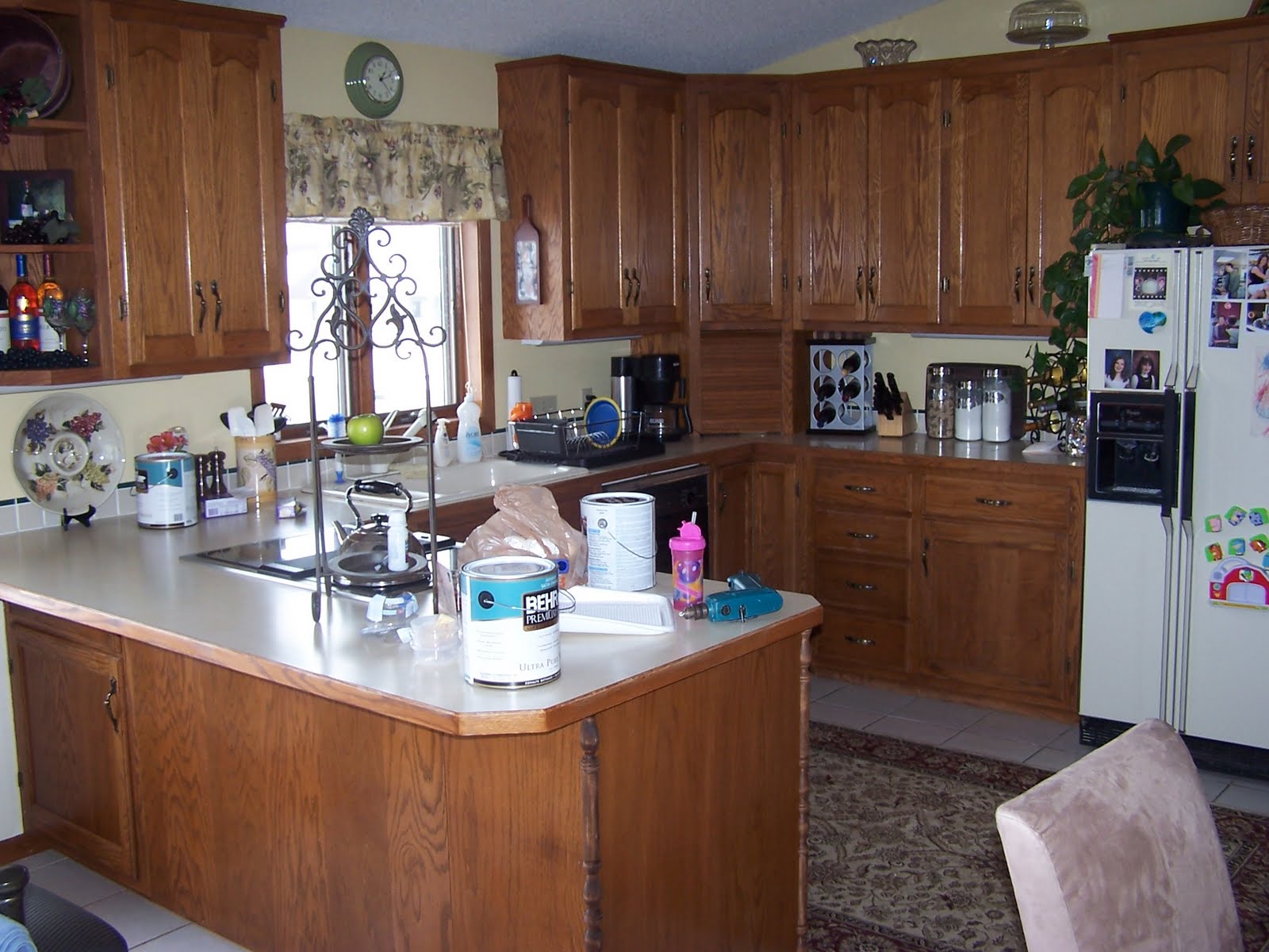
So I told you recently about how my husband and I were in the middle of repainting the white trim throughout the upstairs of our home. Not just a little bit of trim, mind you, it was a lot: doors, the beadboard, our built-in bookcases, the wood trim surrounding our fireplace, the railings and spindles of our staircase, and the kitchen cabinets. Here's what our kitchen looked like when we moved into our home:


Here's what it looked like when we painted it a rich, creamy white for a total transformation:


Tons of work, but well worth the effort! When we decided to go white, all we knew was that we didn't want to pick a white that was too bright and too white. Too white, we thought, would translate into a cheap look for our wood, and we liked warmer tones. So how did we pick our white the first time around? We happened to be looking through the kitchen cabinet selections at our local Home Depot and came across a warm, creamy white cabinet door. We simply plucked the display door out of the rack {with permission from a Home Depot associate} and brought it to the paint counter to be color matched. We loved the result and used the color for all of our upstairs trim. And we lived happily ever after.... until January of 2011.

If you take a look at the color of our kitchen walls, you'll see they're a soft golden beige/yellow {Raffia Ribbon by Behr Premium Plus Ultra to be specific}.


A very pretty color, but being the paint and color fanatic that I am, I had grown tired of it and wanted a change. It was at this exact point that I ran into a problem. Our creamy white trim was so much of a cream rather than white that every paint chip I held up and every sample painted on the wall looked downright terrible next to it. Our trim, I discovered, was so far from white that I couldn't accurately call it white. The cream color of our wood affected how every single color looked on our walls. Think of it like this: you've heard that we each have a warm or cool skin tone, right? Those with warm skin tones look better in off-white shirts and gold jewelry while the cooler-toned companions look best in true whites and silver. The same thing was happening in the upstairs of my home! Because our white was such a warm tone, no cooler color looked good next to it. My husband thought I was out of my mind at first {"Do you know how long it will take to repaint all of the wood? Are you crazy?"}, but after a few days, he realized that I was right and agreed to go the whiter white route.

Holy cow. I had never searched for the "perfect white" before. I didn't realize that there are hundreds of whites to choose from. And here's something fun: what looks like a perfectly fine white in one light can look pink or blue or yellow or any other tint under the sun when you hold it up in another light. {"Fun." Did you catch the sarcasm?} We collected paint chips galore. Home Depot, Sherwin Williams, and Benjamin Moore paint associates recognized me coming in the door and didn't have to ask if I needed help anymore. I was there so often that they simply greeted me with "Hi! Still looking for that white?". I consulted my favorite decorating blogs. I Googled. I read everything I could about the perfect white and found that Benjamin Moore's Cloud White is regarded as the perfect white among several interior designers, but Cloud White looked a little too white in my home. I didn't want anything that gave off a blinding white glow with the lights on. Bottom line: I was picky and driving myself crazy.

Some of the white paint chips I've collected on this journey.

I finally had a moment in the Home Depot parking lot, my lap covered in paint chips. Exasperated, I told my husband, "Just go in and get two gallons of Behr's Swiss Coffee." Warily, he left his crazy wife in the car, probably expecting me to run after him yelling, "Wait! Wait! Not Swiss Coffee! Come back!". It didn't happen, though. I realized that Swiss Coffee by Behr was a good choice. It was white but not too white, and it didn't give off any other hint of color. The deed was done. Finished. We drove home, busted out the brushes and rollers, and two coats later, we had a whiter, brighter upstairs. The difference from the old white and the new white was astounding. "It was never white! It was yellow!" I shouted to Dave. We high-fived and patted ourselves on the backs.

Here you can see the old "white" surrounded by one coat of the new white. Way to go Swiss Coffee!

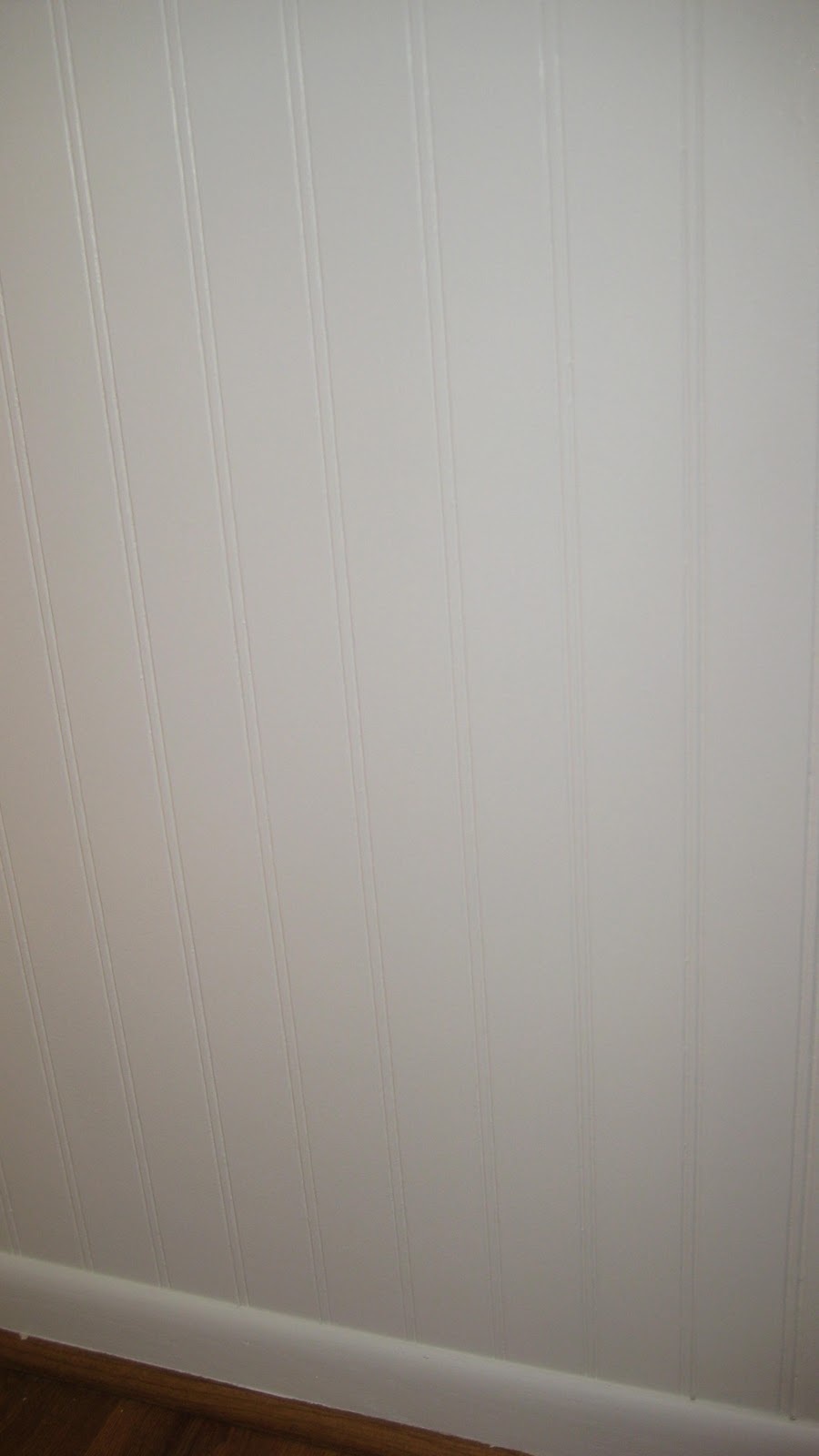
Our beadboard, two coats of Swiss Coffee later....
Besides brightening up our living space, the right white gave us a clean slate to try new colors. If you think I couldn't get any more crazy than I did through the whole "Right White" saga, guess again.

February 10, 2011

3-D Valentines

It's been awhile! I've been preoccupied with repainting the entire upstairs trim and cabinetry a brighter white {it used to be a very, very creamy off white - that's a whole 'nother post!} and helping plan my children's upcoming hockey tournament. It's been chaotic around here, to say the least! But with Valentine's Day only days away, I simply had to make some time to work with my kiddos on some special Valentines for their friends and classmates.

It's deemed by many as "Just another Hallmark holiday," but in this house, we Valentine's Day! When it came time to start thinking about making our Valentines, I knew I wanted them to be personalized, special, and fun, and the kids wanted to share a sweet treat with their best buddies. {Best buddies/future spouses?? Greta has narrowed her husband down to two boys in her kindergarten class - yikes!} I remembered seeing a special 3-D card idea once upon a time, so I ran it by the kids and got their approval.

I started with hanging a large piece of lovey dovey Valentine's Day fabric, and snapped a few pictures of each kid. Here's the key: I had Greta and Charlie pose extending an arm as though they were reaching it out and handing me something. Actually, to make it easier, I had them hold a pencil in the hand they extended to make it easier for a later step in the card making process. Here's what we started with:


For the second step, I uploaded the pics to Walmart's handy dandy photo center and ordered enough Valentine's Day photo greeting cards for each kid's class. You could easily make your own cards if you're feeling extra crafty, but I already told you about life being consumed with painting and hockey; I opted for Walmart's version to make it easier on myself. And don't worry - there's plenty more craftiness in the next steps! The kids knew they wanted to give their friends suckers along with their special cards, so I picked up 50 Valentine's Tootsie Pops at Walmart along with the greeting cards. This is what our Walmart Valentines looked like:


Next, Greta and Charlie set to work writing their friends' names on some simple tags that we made from card stock, and I gathered my paper punch, the suckers, and ribbon.


Remember the pencil I had each kid hold for their pictures? I punched the pencil away with the paper punch {one punch above their fists and one below} and slid the sucker right through.


Ta-Da! It looks like Greta is handing you a sucker!

When the kids were done with writing on their tags, I punched a single hole through each tag and tied them to the suckers with ribbon.


After a finishing touch of some raffia ribbon around each sucker, the Valentines were complete.


The kids had a blast making their cards and can't wait to hand them out on Valentine's Day. And if you're not so keen on loading your kids' friends up with extra sugar, pencils would be perfect for the cards, too. All in all, we were a bunch of happy crafters!
Related Posts Plugin for WordPress, Blogger...